March 20, 2024

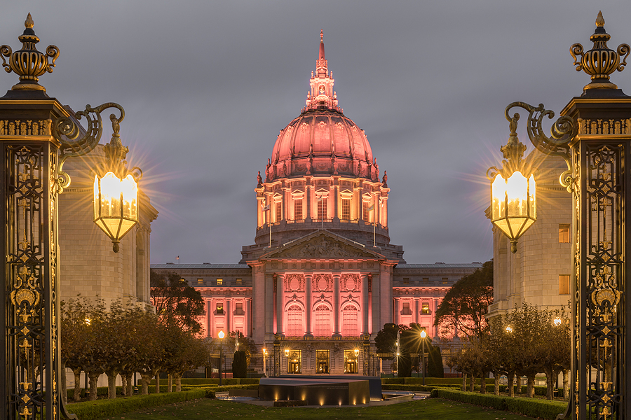
San Francisco City Hall
Source: Bigstock
Why do some buildings make us happier than other buildings?
Tom Wolfe offered an eye-opening explanation in his 2003 collegiate novel I Am Charlotte Simmons: “the existence of conspicuous consumption one has rightful access to—as a student had rightful access to the fabulous Dupont Memorial Library—creates a sense of well-being.”
But why did architects suddenly lose interest in their traditional task of providing the pleasures of conspicuous consumption eight decades ago?
One of my perennially popular Twitter threads is a long 2020 series of photos of city halls from before and after the Year Zero of American architecture, when pleasing the public suddenly vanished as a respectable goal for architects:
The dividing year in architecture is 1945. Before, Westerners tried, in many different styles, to make buildings look beautiful. After 1945, they felt like they didn’t deserve beautiful buildings.
My focusing on city halls lets you see apples-to-apples comparisons.
For example, here is San Diego’s first city hall, built in 1874 in what is now the popular Gaslamp Quarter nightlife district. Tourists now like to hang out in front of the old-timey architecture.
In the 1920s, planning began for a bigger city hall, which after the stock market crash of 1929 was eventually paid for by the Works Progress Administration in 1938. It’s less grandiloquent than some of the other spectacular California city halls of the interwar era, such as Pasadena (1927) and Beverly Hills (1932), thus reflecting the economically stressed 1930s’ trend toward streamlining ornamentation.
Still, most people today would be proud to have their city represented by a city hall that looks like this.
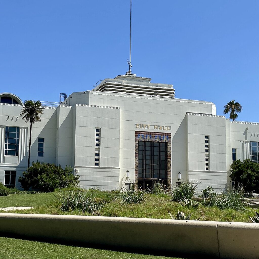
 Up the coast, the 1939 Santa Monica city hall is another fine example of the New Deal’s tendency toward providing dignified detailing without wasting the taxpayers’ money on excessive ornaments:
But in 1964, the city government of San Diego gave up its Spanish revival/zigzag moderne “Jewel on the Bay” to move into a modern steel and glass skyscraper. (The county government of San Diego, no fools, has hung on to the 1938 building.) It’s difficult to find pictures online of the 1964 San Diego city hall, but this structure that resembles São Paulo worker housing appears to be it.
In this century, increasingly prosperous San Diego has frequently kicked around replacing its characterless International-style modernist city hall with something more worthy of this delightful city by the sea. One recent proposal combines a lot of Thom Mayne-style IBM punch-card random windows with some pointless Frank Gehry-style cheap-looking excrescences.
Yet, the basic conceit of shaping this port’s city hall like a sailboat’s sail is appealing. (It’s hard to go wrong with sailing aesthetics. Even Gehry’s Disney Concert Hall in downtown Los Angeles came out looking good because he used a sailboat CAD program to design it).
In recent decades, city hall design has moved away from the blank boredom of high modernism toward perverse detailing that reflects a hostility toward the employees and citizens. Starchitect Paul Rudolph’s 1963 Orange government building, an exercise in tentacle porn brutalism, and Boston’s 1968 concrete city hall, which looks like an upside-down Aztec human sacrifice platform, helped kick off this trend.
For example, Long Beach, California’s 1976 civic center put the city hall in Sauron’s tower (top center) and the public library in Hitler’s bunker (lower left). With all its tank traps, a company of Crips infantry could have fended off an entire armored battalion of Bloods.
21st-century tastes tend to be less brutalist, more fragile-looking. Long Beach’s World War Z city hall, for instance, was torn down and replaced in 2020 by what could be a couple of giant Apple stores.
For instance…here’s Richard Meier’s 2016 city hall for wealthy San Jose, with lots of what appears to be Gehry-esque chain-link fencing attached to the outside.
You might well say that there is no disputing taste. But I think I’ve come up with an objective measure of public sentiment regarding the beauty of public buildings: Simply measure how much demand there is from brides to be married there.
For example, I doubt if the San Jose city hall is booked up as long in advance for weddings as the stupendous 1915 beaux arts San Francisco city hall, where Marilyn Monroe and Joe DiMaggio were married. Tom Wolfe admiringly called it “this Golden Whore’s dream of paradise.”
Others have collected evidence of the 1945 problem. For instance, in 2007, the American Institute of Architects sponsored an elaborate survey of “America’s Favorite Architecture.” In the first round, 2,448 professional architects nominated 248 favorite buildings. In the second round, 2,214 members of the public looked at photos of the architects’ 248 choices and voted for their favorites.
The citizenry’s winner was the Empire State Building, the immensely famous 1931 art deco skyscraper. (I’d probably have voted for the ninth-place finisher, the Chrysler Building, the 1928 skyscraper with its supreme art deco crown.)
The public’s top 50 is rather lacking in post-1945 structures, with only seven. The top two from the past 79 years are monuments: the Vietnam Veterans Memorial in Washington and the Gateway Arch in St. Louis. Then comes the World Trade Center of tragic memory, the new structural expressionist Hayden planetarium on the Upper West Side, and the colossal modernist Sears (now Willis) Tower in Chicago. Also, post-1945 are a couple of retro ringers: the 1947 art deco Delano Hotel in Miami Beach and Steve Wynn’s 1998 Italianate Bellagio casino in Las Vegas, the setting for the George Clooney Ocean’s Eleven.
So, only seven of America’s 50 favorite structures were built between 1945 and 2007. That’s not an impressive total considering our abundance of wealth and talent during that era.
In contrast, the 98 of the 248 buildings nominated by architects that were least liked by the public are laden with works by Bauhaus legends like Walter Gropius and Ludwig Mies van der Rohe.
Why did architects turn against appealing architecture in 1945?
The dirty secret of many of the world’s greatest buildings is that they are great because they are expensive (they please us because they indulge our desire for rightful access to conspicuous consumption), and you don’t want to inquire too deeply into how the funders came up with the money. It’s over the top to say that behind every great building there is a great crime, but there’s something to Balzac’s insight.
I got to thinking about that in regard to the question of why it’s so cheap to visit Bulgaria. I know somebody who took an all-expenses-paid (airfare, hotel, meals) one-week trip to Bulgaria in 2011 for $400.
Why is Bulgaria inexpensive? Well, it’s lacking in tourist attractions, such as magnificent buildings or giant ruins. And why is that? Because, down through history, the people of modern Bulgaria have much more often been ruled by their neighbors, such as the Byzantines and Ottomans, than they have had a chance to exploit others. Indeed, Bulgaria is rather pathetically named after the Bulgars, a Dark Ages tribe that briefly kicked the asses of its neighbors before the region subsided back to its usual role of getting pushed around by its rivals.
A lot of taxes and rent have been paid by Bulgarian peasants over the millennia to build cathedrals, mosques, and palaces in more strategically located places, most usually in Constantinople-Istanbul, which is definitely not lacking in tourist attractions.
Or consider the Parthenon of Athens, perhaps the most admired building in human history.
How did Pericles pay for it? In part by seizing the treasury of the Delian League, a NATO-like mutual defense organization of Greek city-states against another Persian invasion, which he slowly converted into an Athenian empire, which led to the disastrous Peloponnesian War.
Likewise, the Vatican selling indulgences to pay for St. Peter’s basilica aroused the ire of Martin Luther, which brought on the Protestant Reformation and, eventually, the Thirty Years War.
Not all great buildings are purely the product of exploitation. Gothic cathedrals seemed to have been fairly popular with the populace because the locals enjoyed some degree of rightful access to them. Also, the feudal system, for all its problems, tended to mean that wealth, while extremely unequal (having been won with the battle-ax), was localized and less likely to be siphoned off to a distant imperial capital that the peasants would never visit.
And the evolution of the capitalist system made it possible for an entrepreneur, such as Walter P. Chrysler, to acquire, without the battle-ax, vast enough wealth to pay for a great building.
But the stock market crash of 1929 temporarily embarrassed capitalist patrons like the Chryslers. So, many artists assumed that soon only leftist governments could commission their art works. And thus they resolved to make all their new designs reflect the highest architectural priority of Europe’s anti-bourgeois parties: public housing projects.
After World War II demolished much of Europe, it was necessary to throw up large, cheap buildings fast with no time to make them lovely enough so they would satisfyingly last for centuries.
In America, however, capitalism survived and even thrived after the War. Yet, as Wolfe wrote in his mordant 1981 book on architecture From Bauhaus to Our House, the patrons became the patronized:
But after 1945 our plutocrats, bureaucrats, board chairmen, CEO’s, commissioners, and college presidents undergo an inexplicable change. They become diffident and reticent. All at once they are willing to accept that glass of ice water in the face, that bracing slap across the mouth, that reprimand for the fat on one’s bourgeois soul, known as modern architecture.
In this century, however, there has been some evidence that the public is finally getting what it wants rather than what academic architects feel it deserves. For instance, college trustees appear to be demanding that their architects reproduce their campuses’ beloved 1920s buildings, only with bigger windows.
And here in Los Angeles, fire stations are being relocated from old lots that require returning fire trucks to block traffic by slowly backing in, to bigger lots with both entrances and exits. For instance, here’s the new firehouse near USC:
Surprisingly, the new firehouses being built on the bigger lots by an architectural firm in San Bernardino are constructed in styles that brawny men with mustaches appreciate. Firemen have a union and play a lot of politics, so apparently they are one set of conservatives who get buildings they enjoy and are proud to occupy.